How to create a landing page?
Landing pages created for a specific purpose (e.g., acquiring leads, newsletter signups, sales campaigns) are a good way to increase traffic and conversions. Let’s walk through landing page design and consider what an ideal landing page should look like.
What is a landing page?
A landing page is a single web page. The main goals of its creation are to promote products or services and generate more conversions and, consequently, sales. A user (potential customer) arrives at the landing page after clicking on an ad showing him or her in your chosen places on the Internet. The ways to reach the landing page can be several. You can include a link to the landing page in an email blast or in paid social media marketing campaigns, for example. A link to a landing page can be organically elevated to the top of a search (in response to specific keywords) through patient positioning, or SEO.
A landing page differs from a homepage in that it is created for a specific, single purpose. While on your company website you (necessarily) present a multitude of different content, on a landing page you specify the communication and design the customer journey so that within that one domain the customer learns all about your offer, reads the details / additional materials and finally makes a conversion, for example by clicking on a CTA (call-to-action).
A professional landing page is designed to encourage visitors to click on just that button. It should not have “distractors” in the form of other links, nor should it be overloaded with content that does not sell. We’ll talk more about this in a moment. For this moment, it is important to remember when creating a landing page that this page serves only one purpose. In other words, if something is for everything, it is for nothing.
When to use a landing page?
The possibilities for using a landing page are many. Use a landing page if you want to sell a specific product or service. A landing page will also work if you have a need to increase the number of sign-ups for your newsletter (it’s worth using a lead magnet then, something you offer the customer in exchange for signing up – it could be a free e-book, exclusive content, subscriber-only content). An effective landing page will also be great if you are organizing an event, such as a webinar – it’s a good place to collect sign-ups for participation. You can also use the landing page to offer users a “lure” in the form of, for example, a free trial / free access period to your services.
Landing page design
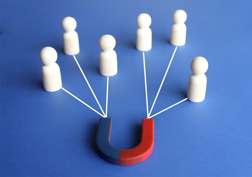
Before you undertake the creation of a landing page, consider what task it is supposed to perform. If you actively bushwhack on the Internet, you’ve certainly managed to look at specific examples of landing pages created by other companies more than once. However, the specifics of each industry are a little different, and you must first of all know who your audience is and what they need. To define your audience’s expectations, Marketing Automation will come in handy – marketing automation platforms can analyze user behavior on the website and, for example, give them a score for certain behaviors. Then you can organize such defined, well-researched contacts into specific audience segments.
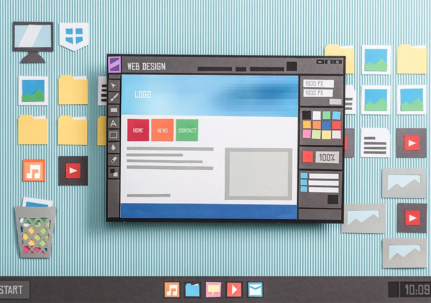
Start building a landing page with a firm belief that the landing page should be clear and transparent. Of course (depending on the industry) some graphical watering holes are highly advisable – after all, the point is not to make the landing page elements completely ascetic. Yes, the purpose of a landing page is to sell, but no one said it can’t be nicely packaged. By the way, you can find various landing page templates on the web if you don’t have a graphic design and design background in your company.
It would be worthwhile to highlight the most important information for the customer accordingly, so that his or her gaze, as it were, automatically follows it and does not run off to the side, leaving the path of purchase. Of course, it would also be appropriate to maintain graphic consistency with the company’s corporate identity – it is better not to create a landing page that will be completely different (for example, in color) from what we have in other materials.
A good landing page is concise. Really, there is no need to elaborate and create lengthy texts. Of course, the more keywords you throw into the landing page content, the better for SEO, but worse for the viewer. Since the landing page has to sell, choose and present users with only relevant information about the product or service. The key is to strike a balance between being concise (you can’t be too vague and enigmatic, after all) and conveying what might interest a potential customer. If you already need to elaborate – because your product is more complicated, for example – break the landing page text into smaller chunks that are easier to read. It’s also good practice to leave blank spaces (white space) on the landing page to make the whole thing look aesthetically pleasing and harmonious.
An effective landing page conveys to the audience the benefits of choosing a particular product or service. It is good to emphasize the advantages over the competition – in addition to price, this is often a factor that influences the customer’s final decision to buy.
One of the underestimated but, in our opinion, insanely important elements is the landing page headline. There is really a lot of potential in it. The more attractive the slogan in the headline, the more it catches the user’s eye. If you’re looking for ideas on how to create an effective landing page, we recommend leaning harder just on headlines – after all, it’s the first thing a customer sees on a landing page. And it’s not uncommon that this first impression determines whether they stay there, or whether they decide it’s not for them after all.
As you go further through the elements of a landing page, don’t forget that sometimes it’s good to show something instead of explaining it in words. A lot of people are simply visual. When creating your landing page, use graphics and photos – this form of presentation of your product or service will be more attractive and will also catch the user’s eye. Not to mention that nice visuals will “tweak” the look of the landing page.
Another issue – the form. There really isn’t much point in creating elaborate forms that require you to enter a dozen pieces of data that you won’t ultimately use anyway, and that will only discourage your audience from coming to your landing page. It’s best to keep the form as short as possible – first name, last name, email address. Of course, don’t forget to give the (necessary) consent to process marketing data. What many people forget when building a landing page is to adapt the form to mobile versions (by the way, not only the form – the whole landing page should be responsive). You can check in Analytics, but we bet that most of your traffic comes from mobile. A good sales landing page also includes a nicely designed thank-you note for filling out the form – make sure the customer feels taken care of at every stage of the customer journey.
Let’s move on to the creme de la creme that every professional landing page should have. The CTA, or call-to-action button. As we’ve already written, the goal of most landing pages is conversions, so they simply must have some kind of final stage. This button directly tells the customer what they should do on your landing page – that is, click it. Therefore, on the one hand, it should be elegantly designed – stand out, for example, in color, position, shape – on the other hand, it should fit in with the overall aesthetics of the landing page. The second important element is the content of the CTA button – the message has to be simple, understandable and unambiguous (buy, sign up, check out, etc.). The shorter and more targeted the text on the button, the better. There is no need to get too wordy, because the CTA will “expand” for us and will look not very aesthetically pleasing.
Some believe that the more CTA buttons on a landing page, the better. We’re not entirely convinced – in the context of what we’ve been saying about the aesthetics of the entire landing page, you shouldn’t overdo the graphic elements. One specific CTA will do a better job and catch the eye of customers.
How to make a landing page that people will want to read and click on? We have already mentioned some essential elements of a landing page. But, last but not least, remember – few people go to your landing page for aesthetic impressions. They want to get specific as quickly as possible. That’s why most of the most important information (plus a CTA button) should be at the top of the page to keep scrolling and searching for content to a minimum.
Social proof in the landing page is another guarantee to increase the interest of potential customers. Nothing works as well for a customer’s purchasing decision as “real life” examples – Gather reviews of your product or service and post them on the landing page. Just remember that the reviews should be authentic, and please, don’t post stock photos as examples of your customers.
SEO landing page positioning
Pay attention to page speed. When a landing page loads briefly and quickly (you can verify this in Google Speed Insights, for example) on both mobile and desktop, the chances of it ranking higher in search results increase. Google’s algorithm, as it were, automatically favors sites that are well optimized for loading speed. When it comes to landing page design and optimization, keep this in mind as well. Don’t forget to saturate the landing page with relevant keywords related to its topic (although don’t overdo the volume of text, as we’ve already established).