10 things to remember when designing responsive emails

In 2024, when you’re creating mailings, you simply need to take mobile users and their preferences into account. That’s because the majority of them use mobile devices to check emails daily. And if your mailing is not responsive – you won’t get much attention from mobile users. Let’s see what you need to pay attention to when designing responsive emails.
According to data published some time ago by TrueList, for almost 60% of mobile users, the first thing they do is check their emails:
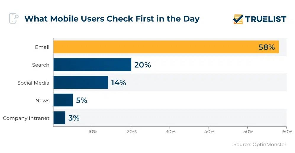
Source: https://truelist.co/blog/mobile-email-statistics/
Therefore, it is likely your customers, at least a big part of them, view your mailings on their mobile devices instead of desktop ones. And as you probably know, because of the smaller and narrower screens, mobile devices need so-called responsive web design (RWD). RWD means that your mailing adjusts automatically to different screen sizes so that every user sees everything you want them to see without the need to zoom in or out.
This is very convenient for mobile users, but for you as a sender, this means a bit of additional work. Let’s have a look at what you should pay attention to.
10 elements of good mailing design for mobile devices
TEMPLATE
First off, if you’re creating an HTML-based mailing, you need a responsive template or layout for your emails. The majority of email marketing tools provide users with templates that are 100% scalable and look equally good on a computer and on a smartphone. Just make sure the template you’ve selected comes with the RWD design.
IMAGES
While the email template can be easily scalable (that’s the case with our templates), images are not necessarily scalable. If you want to send a horizontal image, it will be much smaller on a mobile screen. This means that in most cases, it’s best to create the second version of your image, a vertical one. This way, smartphone users will be able to see everything without pinching and zooming (according to Adobe’s data, this functionality frustrates 32% of mobile users!).
ONE-COLUMN DESIGN
In most cases, it’s best to design your emails so that they have only one column (every section comes below the previous one; there are no two parallel sections). This way, users can get acquainted with the whole email just by scrolling down, just like in the screen below:
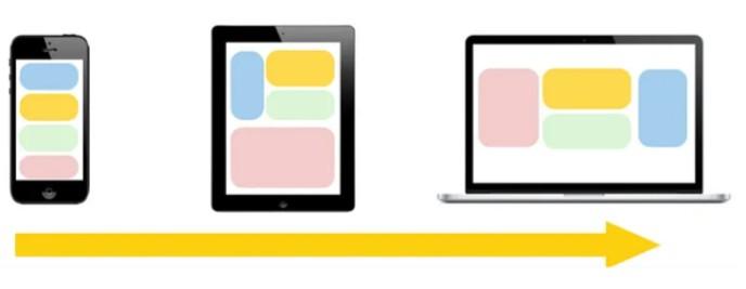
Source: https://medium.com/@daniaherrera/responsive-design-layout-patterns-70e710551818
If you use a responsive design, this should happen automatically, but you still need to verify whether the mobile design is properly organized (sometimes, some elements can move around the wrong way, even in RWD).
WHITE SPACE
When it comes to mobile design, it’s good to use some white space and leave room between sections of your email. This way, it will not feel cluttered and difficult to read. Just remember to leave some room after each section and before and after each button.
LESS CONTENT
This is also important; during the day, users don’t have much time to go through a long email. If you want to reach mobile users, keep your mailings short and sweet. Don’t write too much, don’t include too much information, and focus on the most important elements. In this case, less truly is more.
FONTS
Again, a small screen means users need to scroll to read the whole email. Slightly bigger fonts will make it easier for them to read your emails (no zooming necessary). Some experts suggest that the good base font size (for paragraphs, headers should be slightly bigger) for mobile screens is 16 pixels.
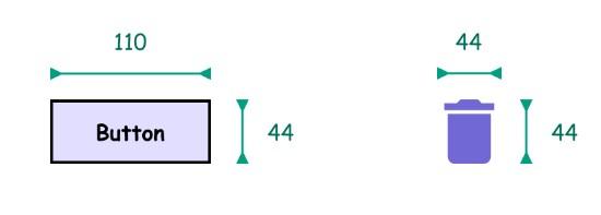
CTA BUTTONS
CTA is a vital aspect of every mailing, so don’t forget to include it in at least one place in your email (typically, at the end or just below the offer). According to the Access Guide based on WCAG 2.1 (Web Content Accessibility Guidelines), CTA buttons should be at least 44×44 pixels in size. This way, they are clearly visible and easy to click, even on smaller devices.
Source: https://www.accessguide.io/guide/large-target-size
THE INVERTED PYRAMID STRUCTURE
In fact, this rule applies all over the internet. The inverted pyramid rule is very simple – put the most important elements and content at the top, and then work your way down with additional details and information. You should provide users with what matters the most to them first. Then, you can expand and give more information, but if you don’t do this, you will quickly lose their attention.
RETINA-READY IMAGES
In general, a retina-ready image is an image created specifically to look sharp on a Retina display, but this rule applies to all high-resolution images so that they look good on devices that have high-definition (HD) displays – and that’s the vast majority of modern smartphones and tablets.
HIDE NON-ESSENTIAL CONTENT
There is nothing wrong with designing two mailings – one that’s more extensive for desktop users and one for mobile users where you keep only the most important content. Email marketing tools sometimes have the option to adjust what you want to show on a desktop device and what they see on a mobile device. Use this feature to ensure all users get the best UX.
Wrapping up: Design your emails with iPresso
Our platform comes with advanced email marketing features. We have 100+ beautiful templates you can use for your mailings and newsletters. And all of them are 100% mobile-friendly! If you’d like to see how iPresso marketing automation works in real life, feel free to start a free 30-day trial. We’re looking forward to working with you!