Analyze Your Email Campaigns In iPresso’s New Dashboard

iPresso’s new dashboard gives marketers the ability to quickly visualize the results of their campaigns.
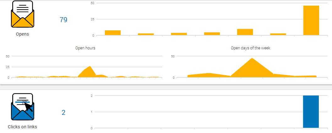
The Email Dashboard includes charts that provide a snapshot of the campaigns’ conversion during a selected period of time (1 day, 1 week, 14 or 30 days).
You can easily check how many emails were sent and delivered in a given period of time, check the days and hours on which they were opened, and see how many recipients clicked links embedded in your messages.
There are also charts that show what kinds of devices were used to open the emails, and how many recipients unsubscribed from your mailing list.

The last charts allows you to see what domains were used by your recipients.


