Squeeze page — an effective way to get leads

Your website is not just a place to present content; it’s a tool to attract and engage potential customers. The primary goal is to guide visitors to help them make the decision to use your offer. One of the most effective conversion strategies is the squeeze page, a page specifically created to capture leads.
A squeeze page is typically a short page that focuses on a single, clearly defined goal—to convince users to provide their email address. Most often, it includes a web form where visitors leave their contact information in exchange for some valuable offer, i.e., a free e-book, webinar, newsletter, or other informational material.

Squeeze pages are often confused with landing pages, but there is a key difference. While a landing page can serve multiple marketing purposes, such as promoting a product, encouraging registrations, or driving traffic to different parts of the website, a squeeze page has one specific objective: To capture user contact information. It is minimalistic, with no unnecessary distractions, and laser-focused on collecting opt-ins for email lists.
Key elements of an effective squeeze page
An effective squeeze page contains several crucial elements that grab attention and encourage users to take action. Here’s an overview of the essential components that contribute to its success.
A relevant and engaging headline
One of the first things a user notice on a squeeze page is its headline. That’s why it is important to keep it concise, clear and compelling.
Imagine that you are looking for a solution to a specific problem, such as how to improve your finances. You go to the website, and the first thing you see is
Want to manage your money better? Download our free guide!
Immediately, you feel you’ve come across something that can help solve your problem. A strong squeeze page headline works the same way. It needs to grab your attention in a second and communicate the value of your offer.

Compelling copy that conveys the offer’s value
Let’s say, you’ve found a website offering a free guide that can solve a problem you’re facing. As you read the description, what would you prefer? A long, complex explanation filled with jargon? Or a short, straightforward message that tells you exactly what you’ll gain? The answer is obvious: the text on the squeeze page should be:
- Easy to understand
- Clear and concise
- Focused on the benefits
It should immediately answer the question, Why is this worth downloading? Highlight the most important information in bullet form or short paragraphs.
Additionally, the copy must be consistent with your offer. If what you promise at the beginning is not reflected in further content, the user will feel misled. It’s like you’re building a bridge – from the problem they have to the solution you offer. If you do it right, they’ll have no doubts about staying and taking action.
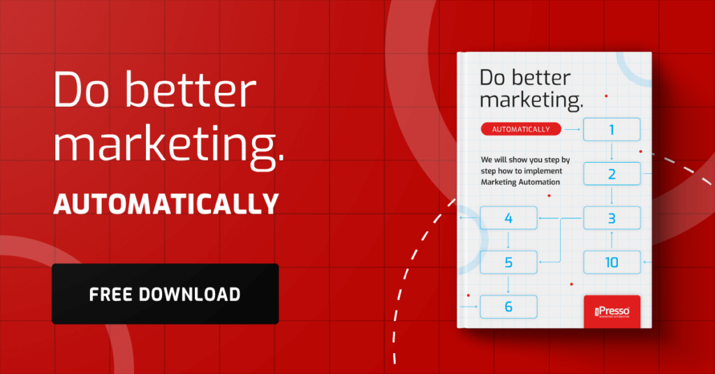
A visually engaging image
Have you ever landed on a website filled with nothing but text? Chances are, you quickly lost interest. People are visual learners; before they read, they first pay attention to the image.
That’s why a squeeze page can’t lack attractive graphics that visually represent the offer. What image will work best? It can be:
- The cover of a free e-book
- A screenshot of an online course
- A photo of the product the user will receive
The key is to choose visuals that immediately convey value. If you’re offering a guide, display an elegant cover. If it’s a course, include a preview of the lessons. Most importantly, ensure that the graphics are high-quality and consistent with your brand’s design.
A strong and clear call-to-action (CTA) button

The CTA button is one of the most important elements of a squeeze page – it takes the user straight to the next step. But how to make it effective?
First of all, the text must be simple and specific. Instead of a generic Click here, use action-driven phrases like Get a free tutorial or Claim your bonus now works better.
And don’t forget to create a sense of urgency. Don’t you feel more motivated when you see the message that says something along the lines of: Today only! Download it for free. Of course, everything must be truthful because a false sense of pressure will only scare users away.
The CTA button must stand out from the page. A gray, dull button will go unnoticed. Use contrasting colors, an appropriate size, and strategic placement (e.g., at the top of the page or directly under the offer description).
A well-designed CTA button is more than just a clickable element – it’s an invitation to seize an opportunity. If you design it well, users won’t wonder what to do next – they’ll just click!
Simple and user-friendly opt-in forms
Why do some opt-in forms convert effortlessly while others drive users away? The secret lies in simplicity and perceived value. Think of it as an exchange – users provide their email address, but they expect something valuable in return. Therefore, before you create a form, ask yourself, What can I give to make them really want to sign up?
Best practices for high-converting opt-in forms:
- Keep it short. The fewer fields to fill out, the better. The most effective web forms often only ask for a name and email. A long form discourages people from filling it out.
- Design it visibility. A clear layout, a standout button and a contrasting color ensure that the form doesn’t get lost on the page.
- Position it strategically. Place it below the header or next to the offer description for maximum visibility.

Social proof: build trust and credibility
People are more likely to take action when they see that others have already benefited and had a positive experience. This is where social proof becomes a powerful tool. The most effective forms of social proof:
- Customers reviews. Short, specific recommendations from people who have already downloaded an e-book or taken a course can effectively encourage new users. Even better if photos or company names are included – this adds authenticity.
- Impressive statistics. Numbers build trust. Phrases like Already 5,000 people have taken advantage of this offer or Join the community of 10,000+ subscribers make the offer more compelling.
Social proof works because people are more likely to make decisions when they see that others have already done it and have no regrets. It’s a simple way to make your squeeze page more effective.
Limited availability: Create a sense of urgency
Nothing motivates action more than the thought that an opportunity is about to be lost. Limited availability is a powerful tool that prevents the user from making a decision “for later” because the later may be gone.
A limited number of spots, a special offer available for 24 hours only, or an Only 5 copies left message effectively draws attention and creates a sense of urgency.
Such a strategy must be credible. False counters or artificial limitations can have the opposite effect and can undermine confidence in the brand. That’s why it’s a good idea to use them wisely – for example, by informing about the actual number of available spots for the webinar or the promotion period.
Wrapping up
A squeeze page is a crucial element of email marketing, designed to collect users’ email addresses in exchange for valuable content, such as e-books or webinars. This page differs from a landing page because it focuses solely on acquiring contact information. To maximize conversions, a high-performing squeeze page should include:
- An eye-catching headline
- A clear and valuable offer
- Attractive graphics
- A simple opt-in form
- Social proof for credibility
- A sense of urgency
If you’re looking for a marketing automation tool that will help you make the most of your squeeze pages, click here, fill out our contact form and we’ll get back to you with a tailor-made solution that checks all the right boxes!